
Sleep is essential for physical restoration, mental clarity, and emotional balance. While many factors influence sleep quality—routine, lighting, bedding—one often-overlooked element is color. As expert house painters in St. Augustine FL, Affordable Actions has helped countless homeowners transform their bedrooms not just for beauty, but for better rest. The right wall color can help calm the nervous system, reduce stimulation, and cue your brain for rest. This isn’t just aesthetic—it’s functional. Let’s dive into which paint colors support deeper, more restful sleep, and why the right painter makes all the difference.
Why Color Matters in the Bedroom?
Color psychology isn’t just theory—it has measurable effects. Specific hues can trigger hormonal reactions, alter body temperature, and even influence heart rate. Bedrooms painted in overly vibrant or cold tones can feel emotionally disruptive. That tension carries into your sleep, often without you realizing it.
At Affordable Actions, we’ve painted hundreds of bedrooms in colors designed to evoke calm, safety, and stillness. Whether it’s for a master suite or a child’s room, the goal remains the same: a sanctuary that promotes rest from the moment you walk in.
Best Paint Colors That Promote Sleep
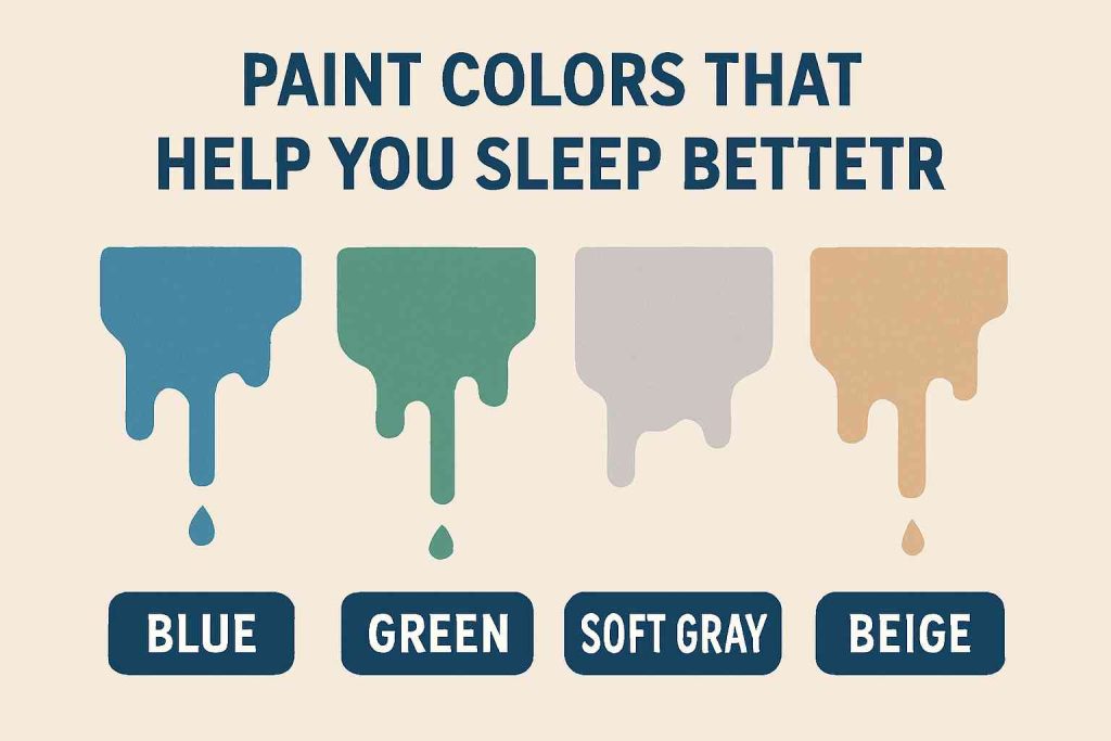
1. Soft Blues – The Ultimate Tranquilizer
There’s a reason blue dominates sleep studies. Soft, muted blues mimic the sky and the ocean—natural elements associated with serenity and openness. These shades help lower blood pressure and heart rate, setting your body up for deep rest. Dusty sky blues, slate, periwinkle, or misty marine blues are favorites among our clients.
We recommend avoiding electric or vibrant blues. They can overstimulate, especially in artificial lighting. Instead, look to matte or eggshell finishes that absorb rather than reflect light, creating a cocoon-like space.
2. Muted Greens – Nature’s Embrace
Green represents balance and renewal. It brings in the grounding energy of the earth and forests. Sage, moss, olive, and eucalyptus are increasingly popular in bedrooms—not just for their beauty, but because they work well with both natural daylight and soft, warm lighting at night.
Green is especially effective for those who suffer from anxiety or restlessness. Its calming influence isn’t dramatic, but it’s deeply effective when paired with soft textures and warm bedding.
3. Pale Lavenders – A Touch of Quiet Elegance
Lavender tones—especially soft, powdery variants—are often underestimated. While bold purples can feel overwhelming and even claustrophobic in small spaces, the right lavender tone delivers a whisper of femininity and calm. It’s especially popular in guest rooms or couples’ suites, where the goal is a blend of relaxation and understated sophistication.
Be cautious with undertones. If lavender skews too blue, it can feel cold. If it leans too red, it may become too stimulating. Affordable Actions helps you test swatches in varying light to find the right balance.
4. Warm Neutrals – Subtle and Grounding
Not every restful bedroom needs color. Sometimes, the absence of bold hues is the very thing that promotes rest. Warm neutrals like taupe, soft beige, and oatmeal-colored paints create a serene, spa-like space. They also allow flexibility with furniture, bedding, and accents.
Neutrals work best when layered with textures: think linen drapes, soft rugs, and wooden accents. The result is an earthy, grounded feeling that anchors the room and the nervous system alike.
5. Soft Pinks – Gentle and Reassuring
When chosen correctly, soft pinks—think blush or ballet slipper—offer emotional warmth without visual overstimulation. They’re especially effective in children’s bedrooms, where safety and comfort are paramount. Soft pinks evoke compassion and softness. Paired with white trim or natural wood, they create a nurturing cocoon ideal for nighttime routines.
Avoid bright bubblegum or fuchsia tones; they’re lively and fun but not conducive to quiet sleep.
What to Avoid: Colors That Disrupt Sleep?
Just as certain colors invite peace, others do the opposite. Bright reds, high-saturation oranges, neon greens, and even stark whites can overstimulate the mind and keep the body alert.
Red evokes intensity and passion—not exactly what you want when winding down.
Orange, though cheerful, increases energy and alertness.
Bright yellow, often associated with sunshine and happiness, can feel jarring at night.
Even pure white, especially in glossy finishes, can feel sterile or too bright under LED lighting. Instead of promoting calm, it can feel like a hospital room.
The takeaway? Avoid extremes. Softness in tone and warmth in hue are what lead to better rest.
The Role of Lighting in Paint Perception
One of the most common mistakes we see as professional painters in St. Augustine is choosing paint under artificial light. Natural daylight brings out true undertones in color, while overhead lights and lamps alter perception.
Cool-toned bulbs will make blues look grayer and lavenders feel icier. Warm-toned bulbs can make taupes look yellow or greens look muddier. That’s why at Affordable Actions, we test colors in both morning and evening light before applying them to an entire room.
Understanding how lighting interacts with paint isn’t just technical—it’s essential. It’s the difference between a room that looks good on a swatch and one that feels right in your home, at all hours.
Finish Matters: Gloss vs. Matte
Glossy paints reflect light and energy, while matte finishes absorb them. For bedrooms, a matte or eggshell finish is almost always the best choice. It diffuses light softly, creating a calming, diffused glow. It also hides minor wall imperfections, which keeps the focus on comfort, not construction.
Satin finishes may work well in nurseries or kids’ rooms, where cleanup is a bigger priority, but even then, keep the tones gentle. At Affordable Actions, we offer durable low-sheen paints that balance maintenance with mood.
Color Pairing for Better Sleep
It’s not just about one color. Pairing matters. A soothing blue wall loses its effect if paired with jarring accents or trim. Here’s how we approach cohesive, sleep-enhancing palettes:
- Cool blue walls with warm white or sandy trim
- Sage green walls with natural wood and off-white accents
- Soft lavender paired with light gray or pale ivory
- Taupe walls with creamy white bedding and brass hardware
- Blush pink with warm beige and muted golds
Texture, fabric, and lighting complete the effect, but color is the base that sets the tone.
Bedrooms for Kids and Teens: A Special Note
Children and teens often gravitate toward bold, expressive colors. And that’s fine—for playrooms or accent walls. But when it comes to sleep, their spaces should also promote rest.
Pastels, soft sage, warm grays, and dusty blues create nurturing environments without feeling “too babyish.” We work closely with families to find shades that children enjoy but still support sleep routines.
Many of our youngest clients sleep more soundly after a room refresh—proof that color has power, even for those who don’t consciously think about it.
Why Choose Affordable Actions?
We’re not just painters—we’re sleep allies. At Affordable Actions, we believe your bedroom should be more than just pretty. It should be your recharge station.
Here’s what sets us apart as the trusted house painters in St. Augustine, FL:
- Color Expertise with Purpose: We don’t just recommend colors that look good—we recommend colors that feel good, based on psychological and physical effects.
- Lighting-Aware Process: We test and evaluate colors in your room’s actual lighting, not just in our studio.
- Sleep-Focused Design Thinking: We align paint choices with your sleep habits, stress levels, and design preferences.
- Clean, Precise Application: Our team respects your space. No drips, no mess, no noise—just clean lines and peaceful transitions.
- Locally Trusted: We’ve painted hundreds of homes in and around St. Augustine, building a reputation for craftsmanship, reliability, and attention to mood as much as detail.
- Family and Pet Friendly: We use low-VOC and non-toxic paints to keep your sanctuary safe and clean from day one.
Let us help you create a space that invites deep sleep every single night. Whether it’s a total color makeover or a subtle refresh, Affordable Actions brings care, craft, and calm to every bedroom we paint.